How to Colour Pair Your Rugs with Your Furniture
Choosing the right harmony when it comes to colours can be quite taxing. Of course, you would not want your place to look overly decorated, right? Especially if you’re not a designer yourself and you just really want your place to look nice and comfortable for you and your guests.
In truth, it really is simple to find the perfect blend of colours if you already have a working theme or motif in mind. First off, what do you want your guests to feel when they visit you? What type of energies do you want your home to exude? Do you want to give your visitors a calm and collected feel when entering your home? Or do you want something that can boldly express your cheerful and vibrant personality?
When choosing the right colour pair, you should first think about what theme you want for your home. Do you like something that is contemporary? Or are you more into bright patterns? Maybe you want to settle for earth colours that can tone down the environment for a more relaxed and tropical vibe?
A unifying theme is important especially when you’re trying to match your rug with your furniture pieces. Now, if you still feel lost in the rug department, here’s a quick guide to help you pick the right rug colour that will give a subtle boost of scenery to your home.
Warm colours
We cannot deny the fact that bright colours really make our heads turn. Certain colours make us go, “ooh what’s that” or “that looks interesting”. These colours are related to the colour red and are known as warm colours. They can influence emotions like feelings of comfort and warmth.

Brink & Campman Atelier Twill 49206
We suggest that you pick a warm colour any time you want to highlight a particular area in your home. For instance, you have a reading spot, or an accent chair by the window that you want people to notice. Warm colours are bold and vivid in nature and can sometimes be overwhelming to some people but with a right eye for detail, you can come up with something that is both striking yet pleasant to the eye.
For instance, if you’re into bright coloured ones such as yellows and reds, then you might want to consider this bright flatweave rug in sunny yellow. The chevron pattern is modern yet subtle enough to tone down that vibrant yellow so you can mix and match it with a low-key neutral coloured furniture.
Style tip: You can never go wrong playing around with primary colours! Just be careful not to overdo it though.
Cool colours
There are colours that just give us a “chill” vibe and they make us want to just go with the flow. Cool colours are those that are related to the colour blue. You may opt for cool tones if you want to give off a calm and serene vibe. Cooler shades influence emotions like tranquility and peace. They tend to make us feel very “at-home” and comfortable. If this is the kind of ambiance that you want to achieve, then go with “sea-like” colours. They would look great with neutral coloured upholstery like white, beige, or cream.

Style tip: You can also try pastel colours like this Zanzibar rug from Rug Emporium. This will absolutely look stunning in a bohemian-themed room.
Analogous colours
Analogous colours are groups of colours that are placed next to each other on the colour wheel. If you’re having a difficult time picking out your colours, this is the easiest way to do it. With analogous colours, you simply select three shades that are positioned beside each other, and there you have it--a rich and monochromatic colour theme. Having similar tones in a space creates harmony that emanates balance.

Style tip: From the three, select one that will be the colour of your rug. Typically though, the third colour is usually a blend of the first two.
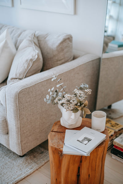
Neutral colours
Done designing your room but a rug is missing? If you want your rug to blend with your colour palette but not stand out too much, then you might want to opt for neutral tones. These are lighter colours that effectively blend in with other shades and they normally complement strong and bold hues.

Some examples of neutral colours are black, white, tan, and grey but neutral colours also have classifications such as warm neutrals and cool neutrals. Examples of warm neutrals are gold, tan, and black. On the other hand, cool neutrals are silver, grey, and white. Choosing a neutral colour will give your rug some flexibility if you want to change your furniture in the future. With it, you can conveniently change the colour of your furniture from time to time and you wouldn't need to find a new rug each time. It’s really very effective and versatile, that is why it is highly-recommended to amateur home designers.
The Rule of Three
In interior design, the rule of three brings out the balance of colours within your design scheme. For instance, the largest objects in a room such as the curtains, rugs, and sofas should have the same shade. The rule of three is usually applied in a monochromatic theme where simplistic designs are also integrated within a larger design scheme.
Now with this quick guide, we hope that we made it easier for you to design your home. In case you run into the same trouble again in the future, don’t hesitate to look us up!